The Design Of Clarity and Metaphor: Meet Craig Frazier
Season 10, Episode 68

Read Time
1 minute
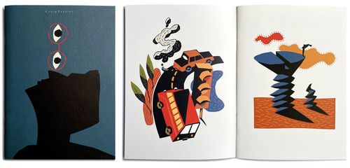
What happens when a designer at the top of his field walks away to chase something simpler, sharper, and harder? Illustrator Craig Frazier did exactly that—leaving a thriving design practice for a life defined by clarity and metaphor.

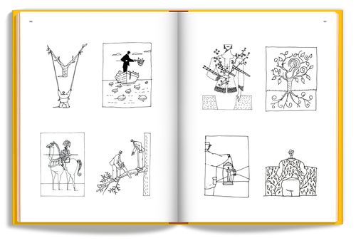
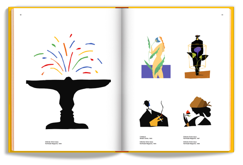
Craig shares how he built a signature style that makes the complex instantly understandable. From Time magazine covers to U.S. postage stamps, his work proves how powerful reduction can be, and why the best ideas often live just shy of obvious.
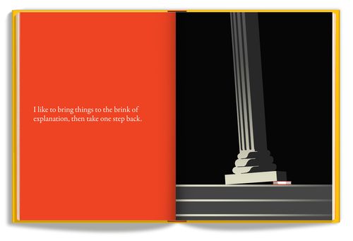
We talk about the moves that changed his career: a humble self-promo that landed Time magazine, a decade-long brand system made of pictures not paragraphs, the discipline of offering three strong options, and why clarity comes from pulling back just before obvious.


Craig Frazier is an illustrator, designer, and author whose clients include The New York Times, The Wall Street Journal, Adobe, and the U.S. Postal Service. His work is known for clarity, wit, and staying power.
In this episode, you’ll hear:
Why Craig left a successful design firm to pursue illustration full time
How clarity, reduction, and metaphor became the foundation of his style
Lessons from projects ranging from national publications to U.S. postage stamps
The role of trust, discipline, and play in creative problem-solving
Why leaping into uncertainty may be the only way to grow as a creative
“There’s not just one solution to everything. The rightness of a solution has to do with its measurement against an objective, not personal taste.” –Craig Frazier
Clarity, metaphor, and discipline aren’t just tools for illustrators, they’re lessons for anyone leading, communicating, or building something that lasts.


